Just over a year ago, I wrote a blog post about the Top 10 Staples I always have on hand for DIY Projects (check out that post here). Looking back over that list, those ten items are still the ones I always keep in stock at our house so I’m ready to jump into a project whenever I want. Today I thought it would be fun to have a follow-up post that focused on the specific tools that we have that we use the most for our projects. Yes, we have more specialized equipment in our workshop, but the twelve items I’m going to share are what we use to complete 95% of our projects. Some are big, some are small, some are investment pieces, some are inexpensive, but these twelve things are the top items that we find ourselves reaching for again and again to successfully accomplish DIY projects at home. And I promise you, even if some of these tools feel intimidating, you can learn to use them!
A small disclaimer before we start: I believe everybody should have a quality hammer and two screwdrivers: one Phillips head (the tip looks like an x) and one flathead (the tip is, well, flat!) These three tools are the most basic items that I think should absolutely be in your home/garage/toolbox and aren’t included on my list, but if you don’t have them already, definitely start there!
Compound Miter Saw

By far, this is our #1 workhorse. A good miter saw is an investment for sure, but it is completely worth it. We use ours for nearly every single DIY project we do! Our miter saw has helped us build everything from small shelves to play kitchens from scratch, update window trim and baseboards, shiplap our office, create a geometric accent wall, even built our basement dining table! It doesn’t have a huge footprint and is easy to set up on sawhorses in a garage, yard, or directly in your workspace. We highly recommend it!
Orbital Sander

We have both a cordless and a corded orbital sander and they each have their pros and cons (battery means more flexibility, but might die midway through on a large project while a cord can be limiting for location, but it lasts as long as you need it to). Regardless of which one is your preference, I highly recommend a sander. We use ours from everything to sanding off old stain to smoothing edges and surfaces on a finished DIY. Having a variety of sandpaper grits available (Justin usually stay stocked with at least 80, 120, 220, and 400) allows you to be ready for any project.
Quality Tape Measure
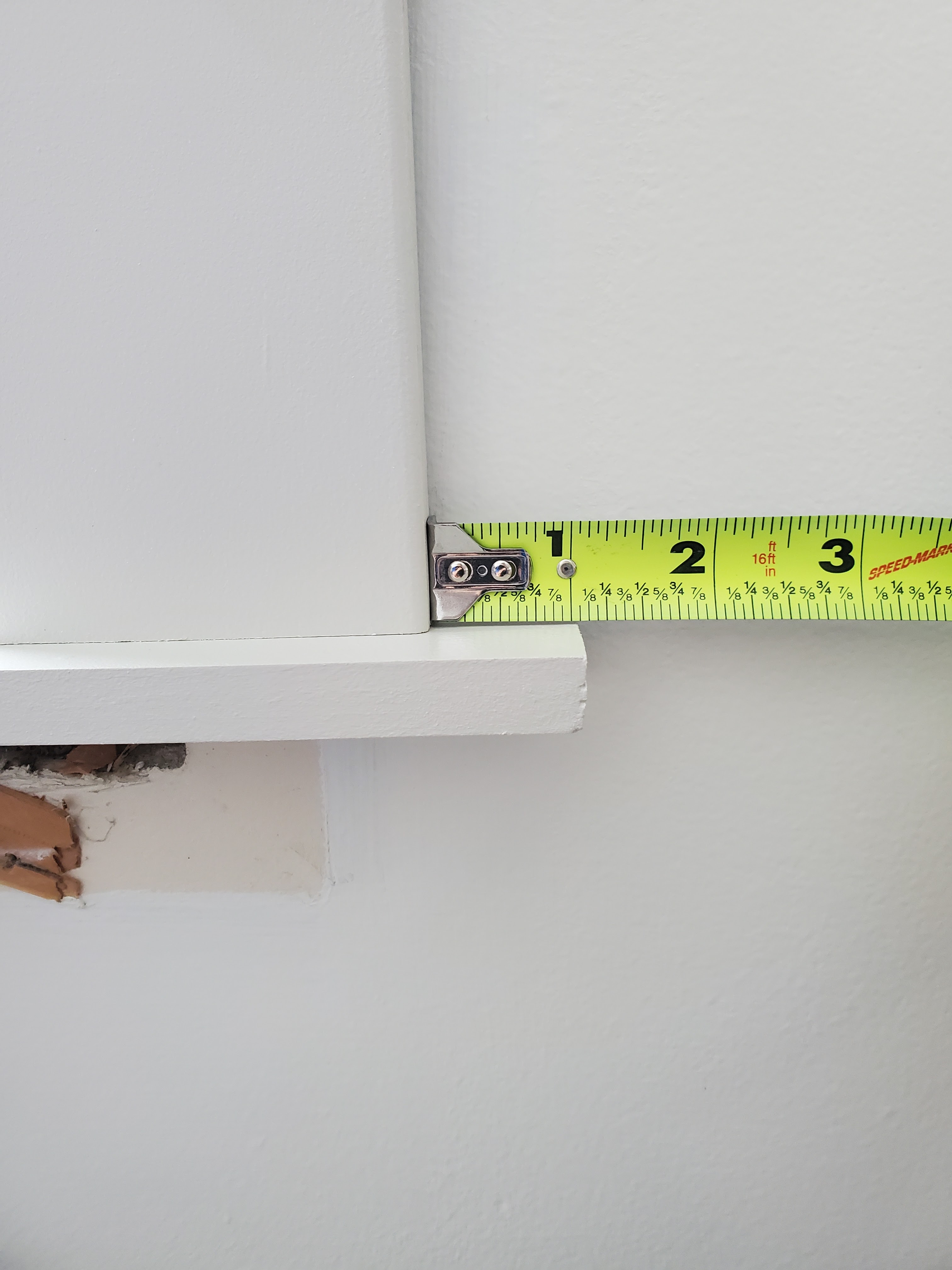
This one seems so simple, but there really is a difference between a solid, quality tape measure and a cheap and flimsy one. It is definitely worth spending a couple dollars more on a high quality one (or three!) that will give you accurate measurements and last a long time.
Level

We actually have three levels: nine inch, 24 inch, and 48 inch and choose whatever size we need based on the size of the project. From the most basic of DIYs, like hanging a picture frame or shelf on the wall, to more advanced projects like building a play kitchen or custom built-ins from scratch, a level is super helpful for ensuring precision. In the picture below, Justin is using a level to make sure the window trim is perfectly vertical while he attaches it with . . .
Nail Gun

I will admit, a nail gun seemed like an intimidating tool at first but now I actually love using it! It makes installing projects like window trim and shiplap so much quicker and easier, and I just think it personally feels empowering to use. Anytime we are installing trim or baseboards or are building anything with wood, we’re pulling out our nail gun. Ours attaches to an air compressor but there are battery-operated options available too. We keep 1 inch, 1.5 inch, and 2 inch nails on hand so we’re ready for different depths based on the scope of the project.
Stud Finder
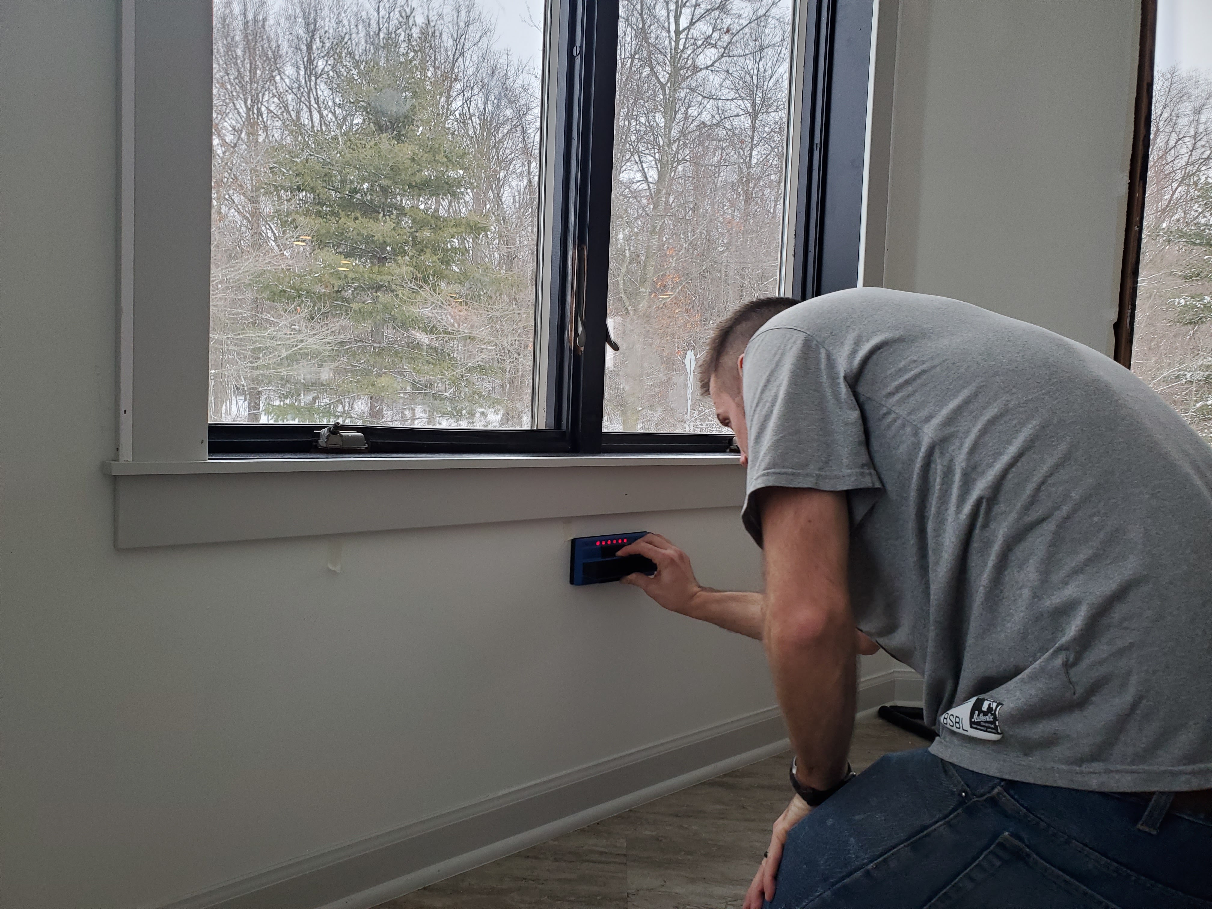
Another small but mighty item, a stud finder is incredibly helpful in the install stage of DIY. If you’re nailing, screwing, or installing an anchor in a wall, you want to know if you will hit a stud or not ahead of time. While you can gently knock across the wall to listen for a difference in hollowness, a stud finder is a more precise way of finding exactly where the stud is. We use ours for everything from hanging a picture to putting up trim – any time we’re attaching something to a wall.
Circular Saw

In the picture above, Justin has created a guide using scrap wood and clamps and is cutting a large piece of plywood using a circular saw. We do have a table saw as well, but we’ve found that we often use a circular saw in place of a table saw for various projects (plus it’s much cheaper and more versatile!) Justin uses this saw whenever we need to cut down a larger piece of wood, like an extra wide plank that is too big for a miter saw to handle or a sheet of plywood.
Power Drill

When I shared the Top 10 Staples I use over and over, an electric screwdriver was one of them. I use ours all the time for small projects around the house and while it is incredibly versatile and handy, a power drill just brings a lot more power (obviously) to a project. It’s great for drilling holes and installing screws quickly and easily. We also feel like it works really well when we’re using larger screws or heavier-duty materials.
Kreg Jig

With our power drill, a kreg jig has come in handy for many projects where we need to screw pieces together securely, particularly when two pieces are coming together at a right angle. We’ve especially used it for projects like shelving, whether it’s a small shelf for books or our large built-in, and attaching table legs.
Clamps
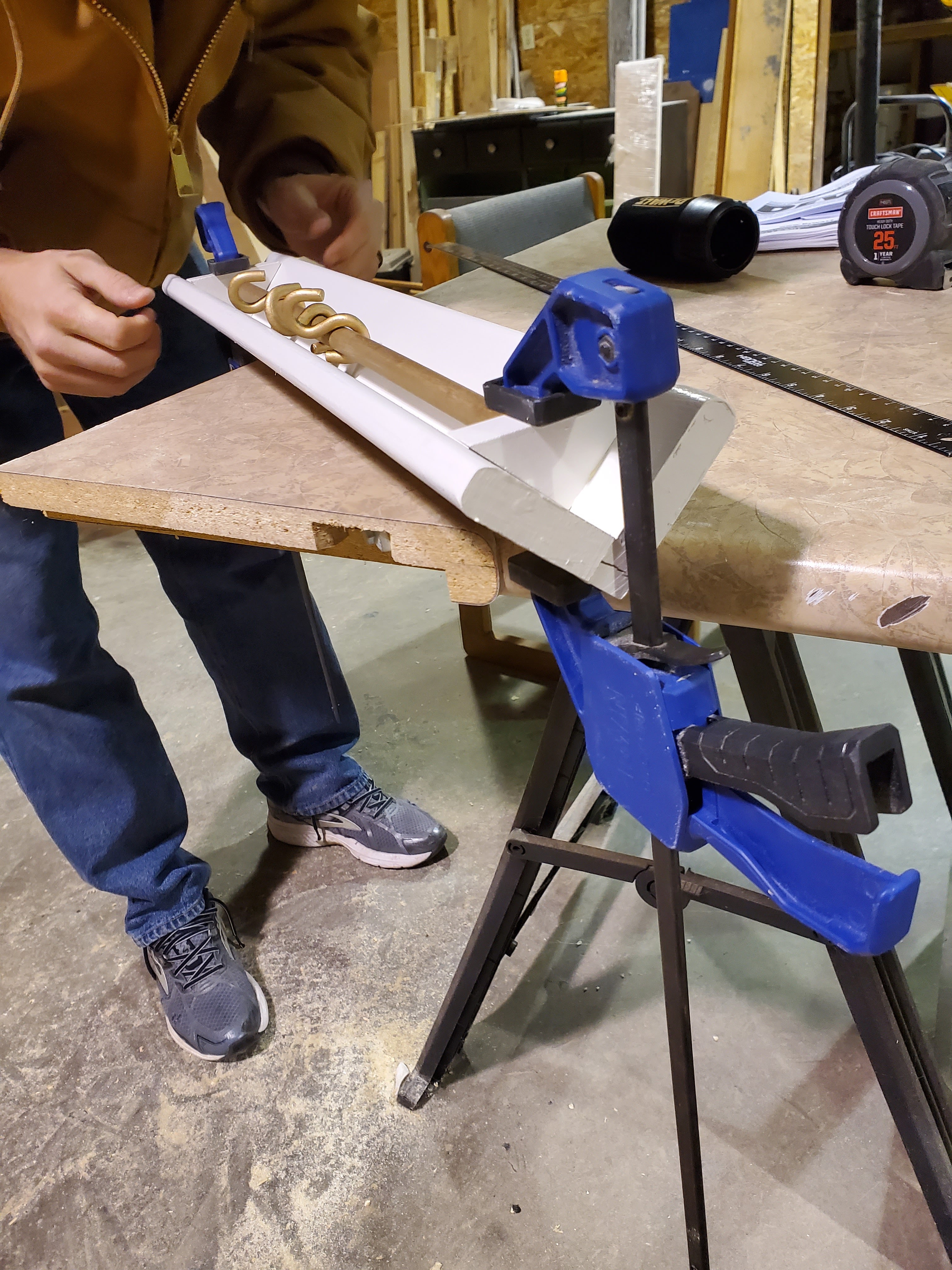
We use clamps over and over (and over) again. Justin frequently uses them to keep wood in place when he needs to make a precise cut, and whenever we use wood glue to attach two pieces together, we use a clamp to keep them tightly bound while the glue dries. I recommend several clamps of different sizes so you’re able to easily clamp in place whatever you need to!
Sawhorses

We have two sets of sawhorses and they get a ton of use during projects. They do everything from holding Justin’s miter saw on projects outside of our home to providing a level surface for a long piece of wood being cut to holding my trim pieces in place while I paint them. Ours are light and collapsible and very easy to cart around the house depending on where our project is.
Right Angle

When I asked Justin what tool he thought should round out the list, he was quick to say a right angle. He has four different sizes of right angles and finds himself reaching for them again and again. It’s always helpful to know when you’re bringing together two pieces squarely, or to test whether the corner of a wall comes together square (spoiler alert: walls rarely do haha!) He is very precision minded and this tool is incredibly helpful in making sure each project is precise and corners are accurate.
And that’s our list! If for some reason something would happen to our workshop and we needed to start over from scratch, these are the twelve items we would start out again with. These are the tools we have to thank for most of the transformations we’ve been able to make in our house and they’re the ones we know we’ll be reaching for again and again in the future. In fact, as I think about the next big project I’m considering tackling, I already know I’ll be using almost this entire list of tools. Time to start planning!